The Best & Worst Central Division Threads of All Time
We have a new season upon us and one of the best parts to the beginning of any season is the freshness of it all. Having new faces on your favorite team or even an old face back (Oh, God I missed you so much, Saad) can completely recharge your fandom. This year has been especially exciting, given there is an entirely new team in the league. On top of that, this is year one under Adidas for all NHL uniforms. The cut and collar of these jerseys differ from Reebok’s longtime look, creating a new uniform for everyone, even teams who made no major changes in the brand switch.
Instead of reviewing each of the changes made to each team by Adidas this year, I wanted to look back at each team’s history of threads. I’ve picked the best and worst jersey for each Central Division team. There are also a few (dis)honorable mentions scattered throughout because we live in the internet age where no misstep can be forgotten. So, without further ado, let’s take a look at the best and worst sweaters in Central Division History.
Nashville Predators
Let's start with the defending Western Conference champs. The Predators have always tried to stand out aesthetically, from their metallic beginnings to their Music City guitar string numbers. But it hasn’t always been a smooth ride. There are several uniforms that could have made the worst list, from their inaugural Blue/Silver Cyborg-Tooth Tiger to their first draft of the Dijon Mustard look. All infamy must go to these blue checkered bums.
Worst Jersey: Depressed Racetrack Tigers
These aren’t gross as much as they are uninspired. The blue, white and black are just boring together. Nothing pops in this jersey. The navy and black are barely indistinguishable from one another. This sweater looks like the old STL Arch 3rd jersey that the Blues used if you sucked all the character out of it. And those checkers at the bottom? I bet you didn't even notice them. Here's a closer look. WHY?? Because of the Tennessee Vols? If so, at least make them visible.
Let's go to the complete opposite of this. Best Jersey: Rebook Yellows
The Preds spend so much time trying to set themselves apart from the rest of the league and this look nailed it. Nashville embraced the yellow that they have flirted with for years and fully committed. Sure, it might be a little much, but that’s Nashville, and that’s the Predators organization. These uniforms look great on the ice and bring a bit of swagger to the unique environment that is Bridgestone Arena. The team get's bonus points for adopting yellow helmets too. It’s a shame Adidas messed with them.
Minnesota Wild
We’ll stick with central expansion and head up to the State of Hockey. The Wild have experimented with a few different uniform trends since their first season in the league. With each, whether you like it or not depends on your personal feelings about the trends. The green, scripted “Fo-backs” the team used as home uniforms during the end of Reebok’s reign are love or hate. So are their inaugural striped uniforms, which rely on Minnesota’s unique logo to do the heavy lifting. For Worst Jersey, I’m going to throw Adidas under the bus.
Worst Jersey: 2017 Adidas Green
I’m a big fan of originality, (see above) and Reebok really hit on something two seasons ago with the Florida Panthers look. I loved how the color scheme meshed so well with the shield logo and the large chest stripe behind it. Apparently, Adidas was a huge fan as well, because they almost completely copied this look and used it for the Wild. PLAGERISM IS NOT OKAY. I also can’t stand the tan stripe. I hate this trend (which was started by another uniform you’ll see on this list) where tan is used to create a fake vintage appearance. The Wild’s color scheme doesn’t need lazy shortcuts to achieve this look. Need proof? Look no further.
Best Jersey: Red Christmas
I’m sure this might have ended up on half of your Worst Jersey lists at home, but I didn't come here to play it safe (Unlike Minnesota.) The deep red, the forest green and the amazing circle crest all scream win to me. That jersey makes the Wild look like they’ve been around for decades, which has been their goal design-wise seemingly from day one. It’ll be a Merry Christmas for me if Minnesota ditches their knockoff Florida gear and commits to these bad boys.
Dallas Stars
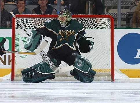
You might have noticed that the North Stars didn’t make an appearance in the entry above. They won’t make one here, either. Dallas has really been searching for an identity ever since they left the north in the early 90s. Mostly, this has resulted in boring looks from their 93’ black to their current Chicago Blackhawks St. Patty’s day Jerseys. But two jerseys stick out in my mind and one of them is really, really, awful.
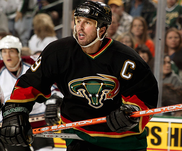
Worst Jersey: The Mooterus
You knew it had to be. The Stars thought they were being soooo smart. Dallas was using the constellation Taurus, which seems like a great idea…in theory. Texas, Stars... cows, I feel you, Dallas, really, I do. Maybe you should have shown somebody— anybody, these uniforms before you mass produced them. Look at them! That logo is meant to carry a child to term. A doctor should really check out that inflamed ovary too. There’s so much more to hate besides the atrocious logo. The black/dark green combo, the stupid star-tattoos on the elbows, which made players look like they belonged to a Planned Parenthood biker gang. God, it’s just awful, someone take this computer away from me so I can find peace in my life again.
Best Jersey: Starter Jacket Cup Winners
That was rough. Lets look at something nice for a change. Like I said, the Stars wardrobe has been mostly boring, but there was one jersey that, in my opinion, married the feeling of Texas, the brashness of Dallas and the name the franchise brought with them from Minnesota. The piping might be a little much, and it does seem a little dated looking back on it all these years later, but the Dallas Stars were at their best and best looking with these beauties. I think the white uniforms are the cleanest, but the glitzy bombast of Dallas really shines with the green and black. Shines…get it? Okay! Moving on.
Colorado Avalanche
Again, I’m only including jerseys that have existed since the team moved to their current location. If not, your hands down winner for both Best and Worst would be the Quebec Nordiques baby blues. But since we’ll see Carolina sporting those in a few years, let’s focus back on the Avs. There haven’t been many missteps since the team moved to Denver. Here is one of them.
Worst Jersey: Colorado Blues
Yeesh. The Avs take the lettering idea from Rangers, use their own funky font, and use a shade of blue that looks like it was dipped in Go-Gurt. The black striping and collar shouldn’t even be there and black under the arms makes it look like the team is so out of shape that they’ve sweated through their threads. Thank God they only used these as 3rds…for six years!!
Best Jersey: OG Cup Winners
Think of the Mt. Rushmore of Colorado. Forsberg, Roy, Sakic & Foote. They all pummeled the rest of the league and looked great doing it in the mid 90’s. These threads are great. The diagonal lines on the bottom and the sleeves turn what could have been a traditional sweater design on its head. Again, the black piping and black numbers specifically on the white sweater haven’t aged perfectly, but this design was strong enough that it heavily influenced Adidas when they were designing the Avs current look. Special shout out to the Colorado Rockies-inspired look that the Avalanche rocked for the past few years. I’m hoping that these make it back in some form when Adidas starts adding 3rd jerseys next season.
Chicago Blackhawks
The oldest team in the division hasn’t radically changed their look in the past 60 years. Before that, however, there were some clunkers. While I enjoyed the Barber Pole originals and 75th Anniversary remakes, I know they aren’t for everyone. As for the oldest looks involving back and white or sweaters with just numbers on them, it feels weird to rag on those 80 years in the future. So, I’m going flog a jersey from the modern era.
Worst Jersey: Wrigley Field Winter Classics
When the Blackhawks were announced to be in the 1st of their 700 Winter Classics, I was expecting a tremendous sweater. Instead, what we got was the original lazy “Fo-back.” I HATE THAT TAN STRIPE! I HATE IT!! That hue of tan looks like something a minor-league team would use on a gimmick “Old Time Hockey Night.” Even more problematic is the logo. Aesthetically, the crest is about as nice as you can make it while incorporating that awful tan. What isn’t okay is the “vintage” Native American in the center. While nowhere near as bad as Chief Wahoo in Cleveland or the logo used by the NFL team in D.C. who I refuse to name, this Hawks’ logo still feels to be in that vein. The normal version of “Chief Blackhawk” can be controversial. This Winter Classic version borders on offensive. No wonder I mostly see it on mouth breathing Kaner fans.
Best Jersey: Classic Red
It’s traditional but not boring. The logo is busy yet simple. The colors pop but complement each other. It’s the best jersey in the division, and possibly all of hockey. That’s what makes the Winter Classic mistake above so galling. Perfection was in front of your eyes the whole time, you mo-rons!
Winnipeg Jets
I’ve kind of tied my hands behind my back for this one, since I’m not allowed to use the Classic Jets, as they are currently plying their trade in Arizona, or the old Atlanta Thrashers sweaters, which would have been a goldmine for Worst Jersey. I basically have three uniforms to choose from. So in 3rd place…
Worst Jersey: Reebok Whites
I’m not a fan of blue on blue. I’m also not a fan of wrapping one blue around another. Those sleeves just look gross. It’s like the Jets strapped four blue capitan bands around their arms and then had them sewed onto the sweater. The blue stripes around the bottom also stand out but in a bad way. I’m not a big fan of the shoulder patch the Jets use and it stands out more with a white background. It just feels like ownership panicked when they moved the team from Atlanta and then never got back to designing real uniforms.
Best Jersey: Outdoor Classics
Going classic was never going to fail for the Jets. The deeper colors that the modern team use really pulls more out of this original WHL design, which is great for a franchise that is not even a decade old as the "Jets". You won’t see these this year, but hopefully, Adidas brings them back soon. True North!
St. Louis Blues
Boy, when it comes to sweaters, the Blues are about as boring and pointless as they have been on the ice during their existence. I really hated most of their Reebok era, with the two shades of blue (SEPARATE YOUR DARK COLORS, NHL TEAMS) and enough piping to redo their arena plumbing. Those weren’t good by any means, but not as bad as my pick.
Worst Jersey: Blues Script Rawlings
The music note logo is amazing. It represents beauty, movement, creativity, and city history. Then the team goes and ruins a great thing by putting their name above that logo in Proto-Comic Sans. Classic St. Louis move. The blue in the sweaters is the SAME of the font of the name. Having too much of one thing? PEAK BLUES.
Best Jerseys: Stanley Cup Powder Blues
This look made a comeback at St. Louis’ first Winter Classic and it looked amazing. You know who else looked amazing wearing this sweater? Jacque Plante and Glenn Hall…on the same team! The late 60’s saw unprecedented success for the Blues, and I’d like to believe that is partially due to these slick powder blue/canary yellow masterpieces they wore. They look dated, but in the best way possible. I’d put these up against the Redwings, Blackhawks or Habs for the best look of all time.


